Graphic Design Branding for Music Festivals
Music is being consumed in a variety of ways in 2013. From set streams, to podcasts, online videos and everything in between, technological advancements allow users to have unlimited access to their favorite artists in most, if not all settings. The occasions in which music is listened to are endless, but live performance still remains the optimal experience.
Facts
There are a large number of music festivals in the United Kingdom, covering a wide variety of genres. Many of the UK's music festivals are world renowned, and have been held for many years including the most famous, Glastonbury.
History
Large-scale modern music festivals began in the 1960s with festivals such as the Isle of Wight Festival and following the success of Woodstock in the United States and free festivals.
Dance music at festivals became more popular in the late 1980s and early 1990s due to the rave scene popular at the time.
In the 21st century the number of festivals has grown significantly, particularly with the emergence of smaller-scale "boutique" festivals.
Why is it interesting?
Over the summer I attended a few festivals and my passion for music and design shaped my interest in designing for events, specifically for festivals and concerts.Why is it interesting?
I really like the branding side which includes the designs of flyers, posters, lanyards/programmes, wristbands and other merchandise to promote that event.
I decided to analyse the branding strategies and design styles of 3 festivals. 2 I experienced this summer and 1 other popular one's and how they attracted certain consumers.
- The Parklife Weekender
The event is usually met with high spirit, as the timing often coincides with the end of exams. Apart from the music stage, you can expect themed chill out zones, live interactive art, funfair, magicians, crazy installations, cabaret and busking stages offering dance troupes, live music, comedy, spoken word and theatre.

- logo.

The Parklife festival logo changes every year, but is generally bold and uses geometric patterns and bright colours to attract it's audience. The 2013 design uses hand renderd and brush style typefaces to make the event look informal and young. The geometric pattern within the letterforms also excudes a fresh and playful feel which the festival is like. Depending on the background of a flyer or poster the colours can change showing a variation in styles for a wide target market. The small icons of a man and woman show the festival is for both genders and with the use of a speech bubbe and flag connote that it's something to be talked about or shared.
- merchandise.
The branding of the festival also creates synergy through it's merchandise.


The iconic logo, transcends through the festivals clothing, bags, fans, lanyards and wristbands to create a strong brand image for it's consumers to recognise and connect with. The apparel ranges from £3 - £16 which is reasonably considering it's target market which is generally students.
- promotion + social media.

The PR company behind the Parklife weekender are www.wearefullfat.com, who also cover festivals such as Unknown, Hideout and Canal mills. The company was established in 2012 and relatively new but have a strong clientele who specialise in culture, entertainment and lifestyle.

The sponsors behind the Parklife weekender are www.bigfishevents.com, who also sponsor V festival, Isle of wight festival, The warehouse project and Ibiza rocks. They work with some of the largest and most loved festivals, international artists and leading UK promoters to find and manage like-minded brand partnerships.
This year the festival exploded with world famous music artists and over 50,000 people in each day. The festival used social media effectively to generate not just ticket sales, but the overall buzz leading up towards the festival and after. Although these companies play a big part in the event, they also promote through Facebook, Instagram, Twitter and videos to keep their consumers informed and excited.


These are some cover photo's from facebook that are regularly updated. The use of photography creates a sense of nostalgia for the festival goers as the can remember the event or see what to expect. Also I really like the use of hand rendered type as it's informal and looks as if it's a personal message from the parklife co-ordinators.
- packaging + print.

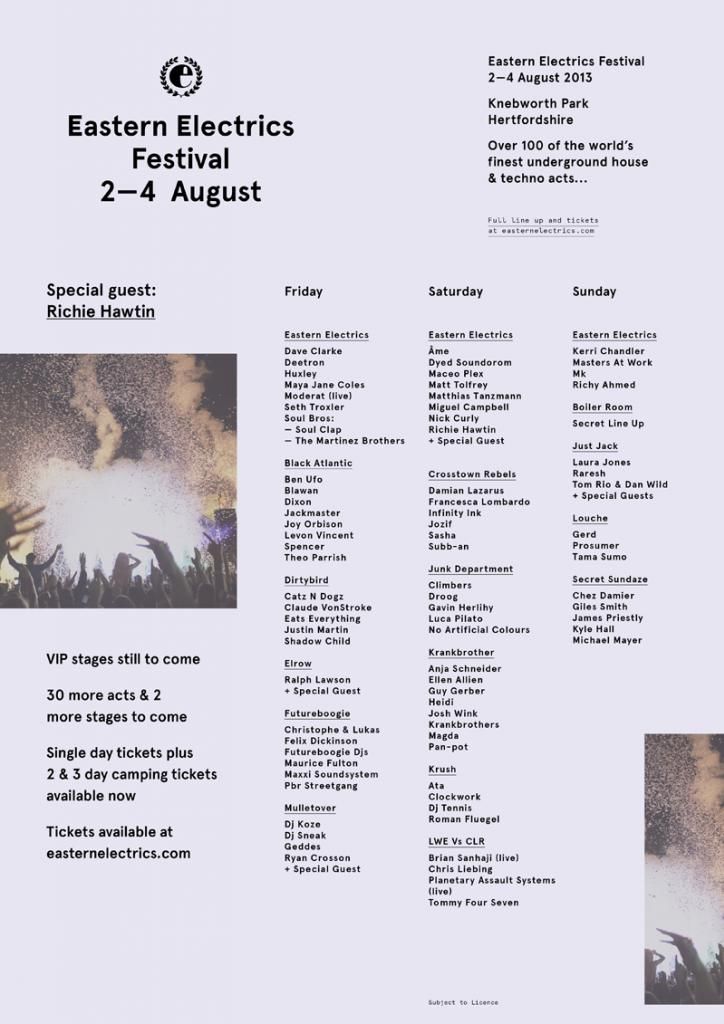
- Eastern Electrics
Eastern Electric is a cutting edge electronic music festival event, that occasionally happens across the year, in exciting "spaces" across the nation
Extending to three days and two full nights,
Eastern Electrics will see over 100 of the finest global artists and sought after rising talents in electronic music, spanning a metropolis of arenas, hosted by more than fifteen underground elite promoters from across the UK and Europe. Running from 2pm to 6am on Friday and Saturday, and 2pm to 10pm on Sunday to offer an epic 44 hours of musical adventure!

- logo.


Similarly like the Parklife logo, the background of the eastern electrics logo changes depending on what flyer or merchandise it's printed one. However the bold e surrounded by a leaf crest is the official logo. The crest creates a earthy feel which links to the festivals location which is mainly in a field and the camping aspect. The design is modern and sleek which keeps creates synergy between the genre of music played there which is underground house, techno and electro.
- merchandise.
The synergy of branding through it's merchandise

2013 Programme


2013 Merchandise
Again using the recognisable logo creates a connection with the market and it will remind them if their time at the festival.
- promotion + social media.
The festival is also sponsored by www.bigfishevents.com just like parklife which indicates that they have a similar target market to attract.


Also just like parklife they connect to their target market through online media such as Facebook and create digital countdown flyers until the even has started and ended. The type in the flyers is very modern and futeristic, which suggests how popular culture and the genre of electro music has heavily influenced the festivals design aesthetics. Also the bold use of photography again creates nostalgia the style of shots are very closed to make it look intimate. The colours in the shots are also bright and warm to give off a summer vibe.
- packaging and print.
Bunch developed the visual identity including printed collateral, billboards, signage, wristbands and the photo-library for the festival. The customised letter E within the classically cut Aperçu is combined with EE's 2012 summer event photos, while the earthly-toned colour coding enabled diversity of each series of advertising announcements.


The design company really created synergy between each piece of media by using earthly tones, from the flyers event down to the set times for when the artists were to perform which overall created a strong brand image.
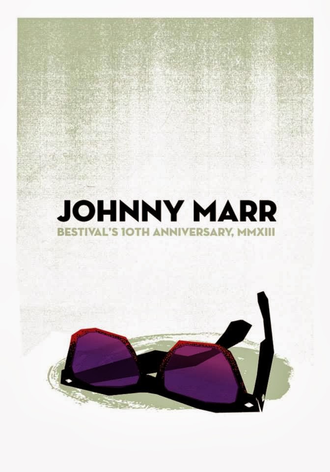
- Bestival

Venue:
Robin hill country park, Isle of wight
Age:
17 and under year olds must be accompanied by an adult
When:
Thursday 4th Sept 11:00 - Sunday 8th Sept 5:00
Length:
4 days (camping)
Music genre:
Indie, House, Hip Hop - 2013 Line up
Price:
£170

The logo is applied to a multitude of merchandise from tote bags to mugs. The target market is very big for this festival and the online shop even had a department for kids.


Again the digital countdown till the festival which is promoted through online cover photo's.


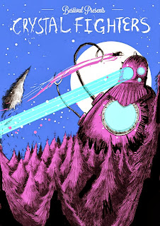

- Bestival
Bestival is an award winning 4 day boutique music festival set at Robin Hill – a beautiful leafy country park (a veritable Garden of Eden!) near Downend and Newport in the heart of the Isle of Wight. The wonderful world of Bestival was born out of ten fun years of pioneering music events and record releases from Rob da Bank’s Sunday Best empire. The BBC Radio 1 leftfield DJ had a dream to one day create his vision of how the modern day festival should be. Along with Creative Director and wife Josie da Bank and co founders / partners John and Ziggy from Get Involved that dream is now fulfilled. On a mission to change the face of independent festival culture, the fearless foursome are bringing some magic to the shores of the Solent and spreading the love worldwide. - Source

- logo
The logo for the festival uses both serif and script fonts for the logo, which has been seen uses in some of the logo's above. Again it gives off a relaxed and informal style and visually works well together. The colour scheme of black, yellow and pink is bright and playful and by using the colours interchangeably on certain letter forms makes the words stand out. The logo unlike some also uses a lot of body copy, including dates, location, quotes and the co-ordinators which suggests that there is a change in the festival from previous years or that they want to make a clear and factual message to it's audience. There is also a use of flag icons which was presented in the Parklife logo which again could suggest this is a popular theme in festival logo's.
- merchandise

2013 programme, tote bag and book.


Graphic designer Kate Moross even created a special hand renderd style t-shirt which shows it's connection to the art and design as a festival.

- promotion + social media.
Again the digital countdown till the festival which is promoted through online cover photo's.


Unlike the other two festivals, bestival creates it's cover photo's in the style of an illustrator illustration possibly due to the festival being on the isle of wight and the theme of getting a boat there is excentuated. The covers also increase in colour depending on how close it gets to the festivals opening which suggests it's an exciting event.
At this year’s Bestival, Oxfam GB collaborated with creative agency Scriberia to stage an on-site art installation, illustrating peoples support for the charities ‘Love Syria’ campaign. Over the summer Oxfam has been asking people to show their love and solidarity for Syrian people at seven major UK festivals


The festival again is using innovative ways to promote the event through good causes that are related to political and social issues.
- official pages
- print + package.
The festival creates a strong brand image through it's use of line-up flyers and posters by using the same colours and images through out the printed material with slight variations. Josie da Bank the creative director of the festival is responsible for comming up with the brand image and designs, she is also an illustrator.


The festival not only sells t-shirts and mugs, but as other memoribillia for the festival, they also sell A2 screen prints of the most popular headlining acts from £20 each. I really like this concept as it's very unique and gives consumers the opportunity to know about new and upcoming designers. The project is called Screenadelica and has been active since 2009.


From this research I have discovered that depending on what audience the festival is targeted at, will then influence the design. There are a lot of other factors that also influence the design of these festivals and that also includes, genre of music, venue, price, theme, social, political and cultural factors.
No comments:
Post a Comment